
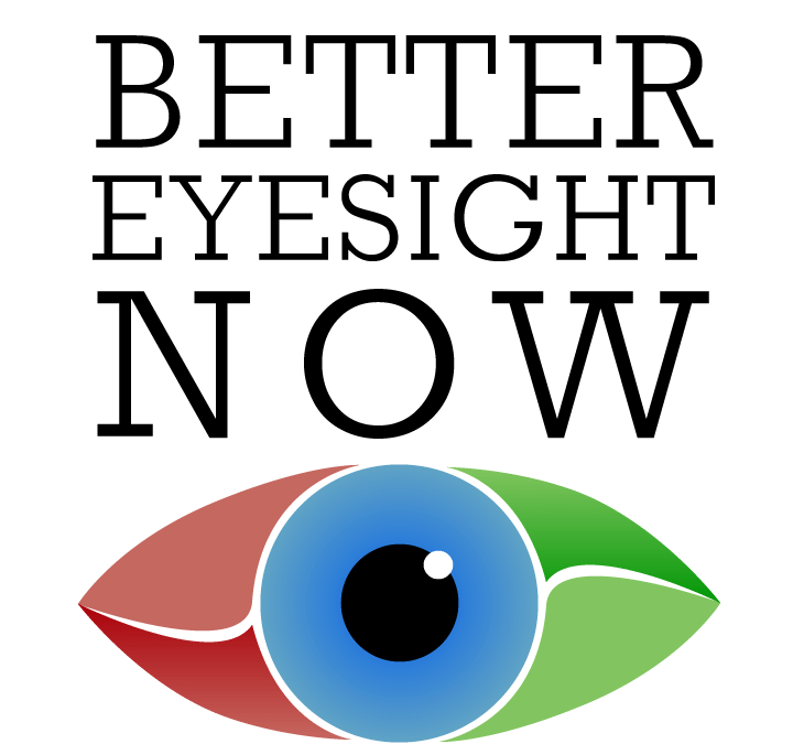
The concept behind this design comes from the Client providing a holistic approach to improving eyesight. The colors are in harmony, consisting of Red, Green and Blue that create ‘light’, moving from Red (which is bad) to Green (which is good). Red and Green also representing color blindness, which is why they are either side of the Blue Iris. The curves in the eye create a Yin and Yang shape where the eye becomes harmonious.
The text is written in the font used in the eyesight chart that is popular with Opticians all over the world.