There are many clever, quirky, perhaps funny images on this site, but this relatively boring image expresses one of the most important things in website design today.
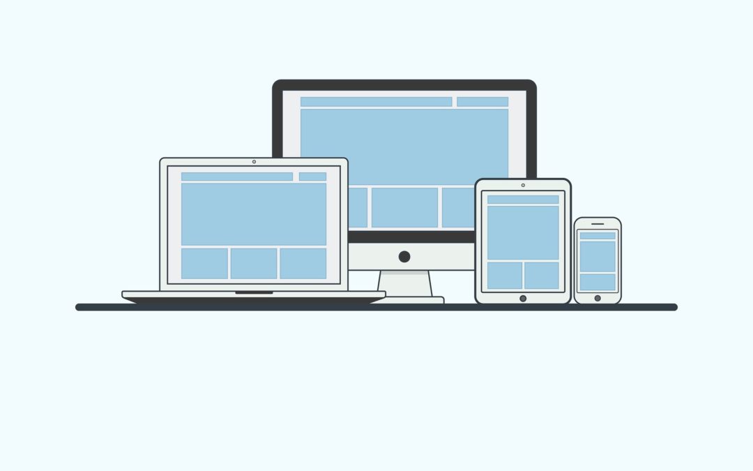
Responsive behavior of a website describes its ability to respond to the device that the web browser is running on.
We live in a world where there are hundreds of different devices that people use to view Web Pages on the Internet. Some are old, some are brand new, the world of the Internet is stretched between old computers that have not been updated in 10 years and new devices that the internet is trying to keep up with.
What matters most is a responsive design – it protects you and your website against history and change. Responsive design delivers your website to everyone that finds it.
The Moose only does responsive design, using a ‘mobile first’ methodology, where we consider the mobile phone experience first and then flourish the website for people that are on PC or an Ultra HD Monitor.
Most of our designs you can check out for yourself because they are live and you can go and look at our client websites.
This website is responsive. Check it out on your tablet and phone. See what you think.